Steps for Week v1 (11/14/19 – 11/21/19)
a.) Pixelate live stream + get RGB values of each pixel
First I pixelated the live stream. This was the reference code for pixelating the live stream: pixelate effect (using this one!). Then I tried to find the rgb value for each pixel. I used the MDN example for that: getting pixel data from context

—–
b.) Converting RGB to Frequency
- RGB to HSL
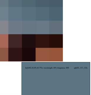
- After pixelating the live stream, I needed to convert rgb –> hsl (hue|saturation|value), then hue –> wavelength(nm), then wavelength(nm) –> frequency (THz). This is to ensure that the conversion from color to sound is scientifically accurate. From the
- First things first: I converted the RGB to HSL in order to access the number for hue. After getting the Hue in the HSL, I need to convert Helpful resource for converting RGB to HSL: here.
- Here’s my test code for pixelation with the rgb and hsl values printed in the innerHTML: here

—–
c.) Convert Hue to Wavelength (nm)
Helpful visualizer for converting hue to wavelength: here.
stackoverflow – convert hue to wavelength
convert hue to wavelength
    //convert hue to wavelength
    // Estimating that the usable part of the visible spectrum is 450-620nm,
    // with wavelength (in nm) and hue value (in degrees), you can improvise this:

    let wavelength;
    wavelength = Math.ceil(620 - 170 / 270 * h);
Checked using this site that converts color to wavelength (nm). For ex: tested to make sure the blue is around 400.
—–
d.) Convert Wavelength (nm) to Frequency (THz)
Helpful site for understanding and converting wavelength to frequency: here
Based on this equation:
Wavelength (Lambda) = Wave Velocity (v) / Frequency (f)
The code for converting from wavelength (nm) to frequency (THz) is this:
frequency = 3 * (Math.pow(10, 5)) / wl;
The above code also works for converting! I checked it just by making sure this blue is around 600 – 668 THz.
—–
e.) Using frequency (THz) to make sound
I was able to take the functions I wrote from midterms to get a sound that mapped the color frequency (400-789 THz) to a pitch frequency range (20-3000 Hz).
Previously, the sketch was giving me an interesting feedback-y type sound. Wasn’t sure what it was but Shawn added in this snipped of code which helped with making each pixel have a distinct sound.
Next step is to figure out how to get the sound to only play once when on mouse over.
—–
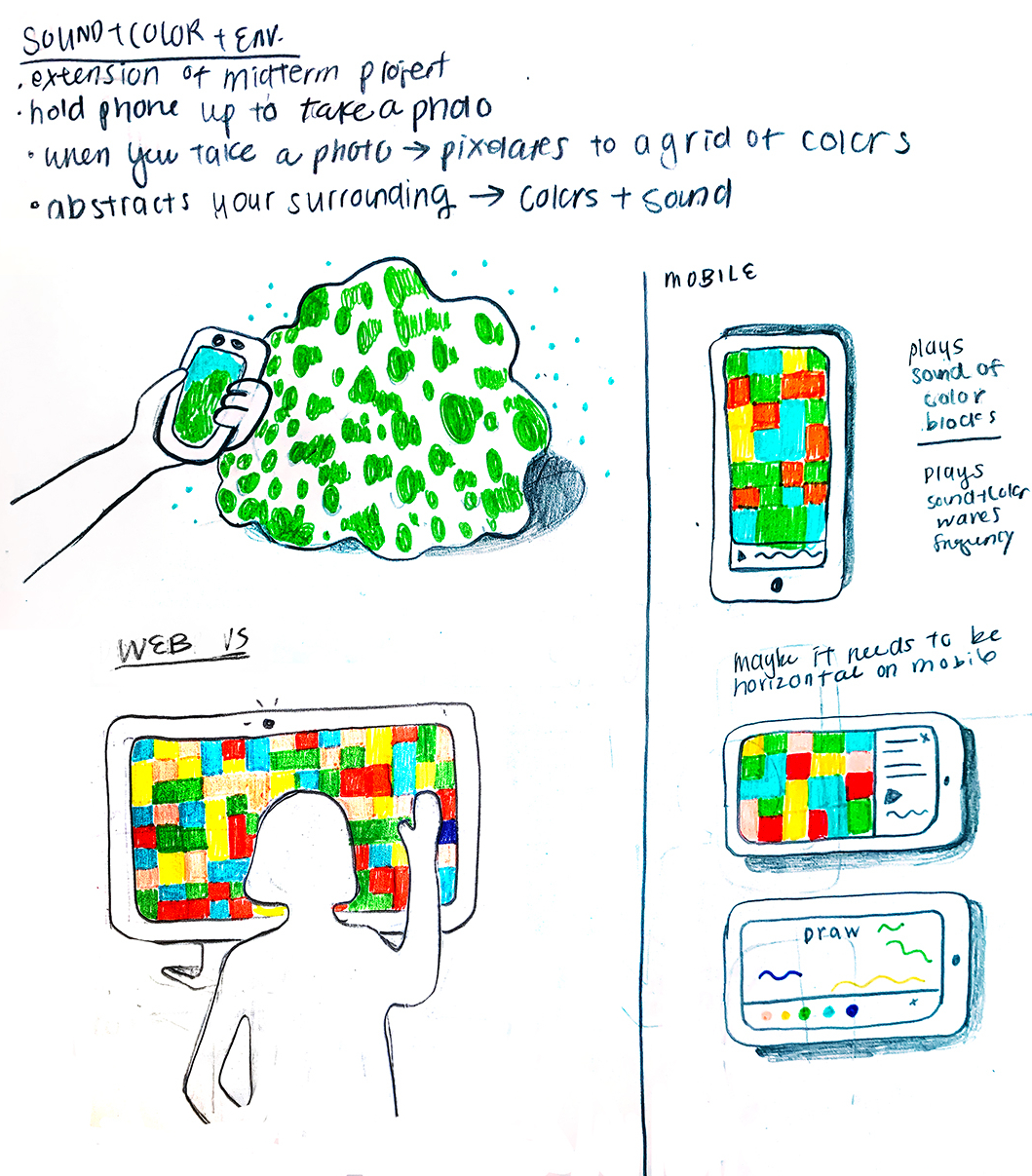
f.) Design for Play Modes
Example sketch layout for introduction to the Play app. This is where people can select which mode they want to try out.
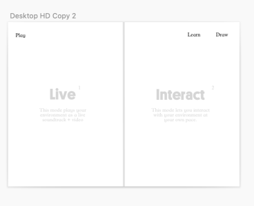
Example layout for the 2 different modes. They don’t differ that much in visuals, just in how the user can interact. Live mode has a play head so it’s more like a soundtrack. Interact mode allows you to mouse over each color pixel.